
How creating with intention can help you place higher in Spoonflower Design Challenges.
After months of frustration with the design challenges, something clicked for me in the Spring of 2025. From that moment on, I made it ten times into the top 100 in the remaining Spoonflower Design challenges of that year. Today I want to share the practices that help me best and how you can apply these strategies too.
No time to read the whole article? Jump to TL;DR!
I started selling on Spoonflower in the Spring of 2024 and also participated in the bi-weekly design challenges right from on the beginning. But in 2024 I did so quite irregularly. Then I challenged myself to participate in every challenge in 2025 (read more about why and how this helped me grow my pattern design business here). But not only did I want to participate in every challenge, I also wanted to reach the top 100. So, I created designs that I thought fit the prompt well, submitted, got my hopes up, and — no top 100 placements.
Let’s take a look at my first submission ever: The Vintage Glamour Metallic Wallpaper Challenge in June 2024. I submitted this Art Deco Lotus Flower Design and all designs were shown on the gold metallic wallpaper.
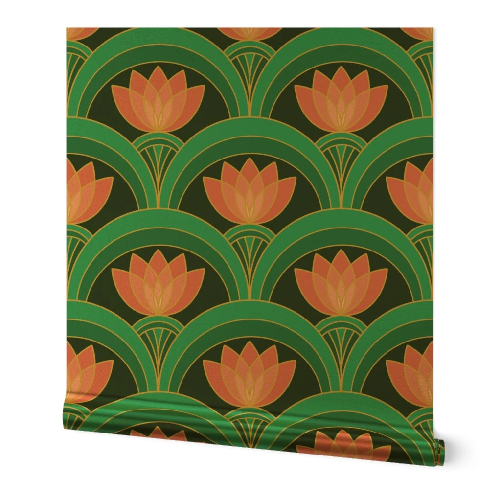
I cringe a bit when I see this submission now. I did not create this design specifically for the challenge, I had just happened to create it before. I think the design itself fits the challenge quite well, but there are things I would do differently today, the main points being color and scale. The colors on the gold metallic wallpaper just look different and let’s be honest, the gold doesn’t do anything for my color scheme. The scale should also have been bigger with only one repeat showing on the wallpaper.
Challenge placement: 478.
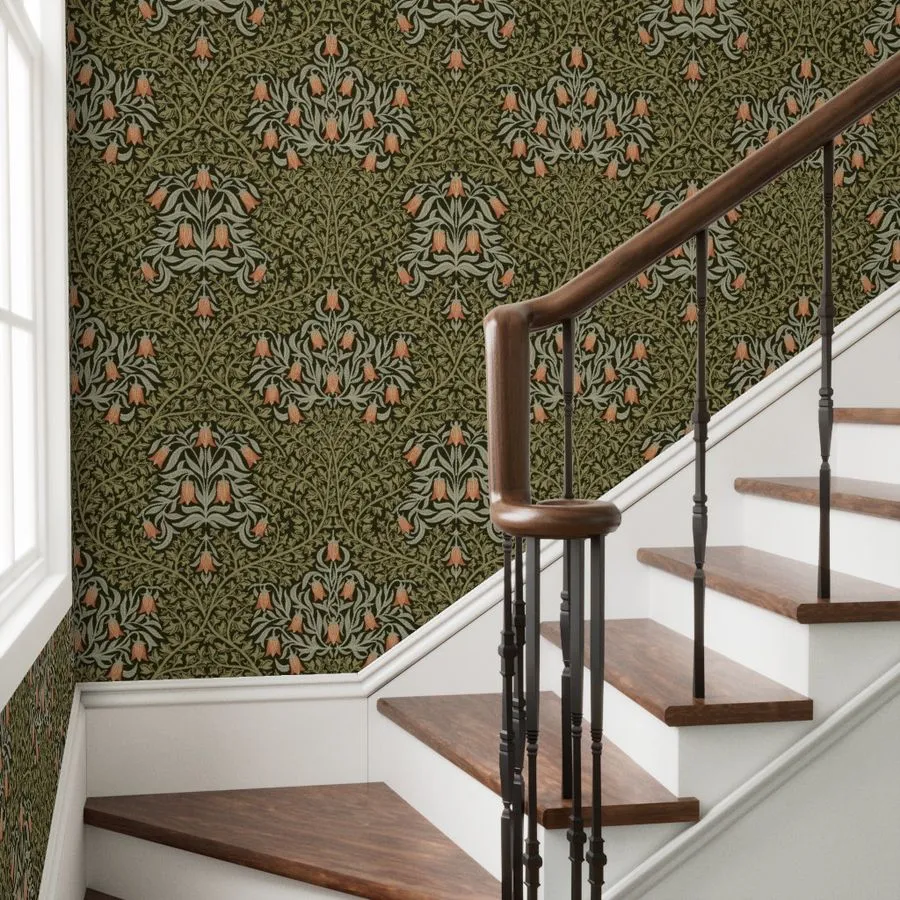
Fast forward to the Heritage Revival Challenge in March 2025. This challenge was very much up my alley. I love Arts & Crafts so I decided to go with a William Morris style design. And without realizing it, I applied the exact strategies that I am now going to share with you. I made it to place 96 and began to understand which intentional steps can help in placing higher.
Before we dive in, I want to say this: While getting into the top 100 definitely helps you, if only for the “award winner” badge that your design receives, as I laid out in my last post, participating without top 100 placements already brings many benefits. Also, and this is very important, it doesn’t say anything about your skills as a designer if you don’t place in the top 100! It doesn’t even have to be your goal to place high. But it was mine and I want to share the strategies that helped me. These strategies can help you in other design challenges or contests too, or even for pitching your portfolio!
Disclaimer: I am not getting paid by Spoonflower for writing this post. I’m just sharing my own experience.
6 Intentional Practices that Help Me Reach the Top 100
The most important word here is intentional. Easier said than done though, right? So let’s go through my list to clarify what exactly I mean by intention.
1: Do your Research
It sounds so easy but I wildly underestimated this step when I first started participating in the challenges. One reason why my Arts & Crafts design in the Heritage Revival made it into the top 100 is that I didn’t need to do the research, simply because I already knew the topic well. But that is not the case for many of the other prompts.
Let’s look at my Vintage Farmhouse Poppy Block Print Floral Design that I created for the Floral Block Prints Design Challenge:

I knew a bit about block printing but not too much. So I started a little deep dive. I usually do my research through various inputs: I gather some written info through Google or Wikipedia, I get some visual impressions on Pinterest, and I might additionally get some input from an AI chatbot (using the AI to support my work, not do my work for me!). In other words, I try to diversify where I get my info from. Of course, not all challenges require the same amount of research, but getting some visual impressions on Pinterest or Google Images is the minimum I do.
Things to look out for (no one size fits all, always depends on the challenge prompt):
- What are common motifs
- What are frequent colors
- What are typical pattern structures
Additionally, you can also go through the old challenges and see if you find similar topics to the current prompt you’re working on. But keep in mind, the idea is to get inspiration, not to copy!
In the case of my Poppy Block Print Design, I learned that many block prints contain only one single motif, that the motif often has a dark outline with the color of the motif often spilling across the edge of the outline, and that characteristic colors of traditional block printing are vibrant blues, yellows, greens, or reds.
Challenge placement: 41.
2: Don’t Skip the Brainstorming
While research lays the groundwork, brainstorming is the next very important layer. I make sure to take some time for my brainstorming. That doesn’t mean I sit at my desk (or kitchen table) and stare into the air. Instead, I give it a day or two, continuously coming back to the challenge in my thoughts. Letting the ideas simmer a bit really helps me to come up with more elaborate ideas.
My approach is usually thinking about the design layout first. Once I have settled on that, I think about which motif(s) I want to incorporate. From there I go to color.
And while it might be tempting, I don’t let AI do this part! My main reason being that I don’t want to loose my authenticity as an artist. I also don’t want to take away from my own learning experience. Other reasons include that other designers might do the same and then you end up with similar pattern ideas.
3: Incorporate Popular Motifs
Some prompts might have typical motifs, others might not. I have found though that florals are always popular. So if you can and want to incorporate some floral elements, it definitely won’t hurt. Furthermore, if you look at past challenges, you will find many animals in the winning/top 100 designs.
That is why for the Vintage Florals Challenge, I decided to also incorporate birds in my Chinoiserie Trailing Vintage Florals Design.

Challenge placement: 75.
You can also consider including other trending elements like bows.
4: Give it Your Own Twist
If you create a design with typical motifs, traditional colors and a recognizable layout for the prompt, you already have a lot going for that design. But it might actually not be your own style. Or it might not stand out because people have already seen many similar variants of this design.
So I usually try to give the designs my own twist — without losing the connection to the original prompt.
Let’s take a look at my Toile de Berlin Design for the Toile with a Twist Challenge. I stuck to a typical Toile de Jouy layout and the monochrome color style. However, I created a modern Toile version with architectural motifs of Berlin (my hometown), connected with floral elements. I further went with bright pink instead of a classic Toile blue color scheme. Yet, it is still clear at first glance that it is a Toile de Jouy design. Striking the balance between recognizable elements and your own twist is the key here.
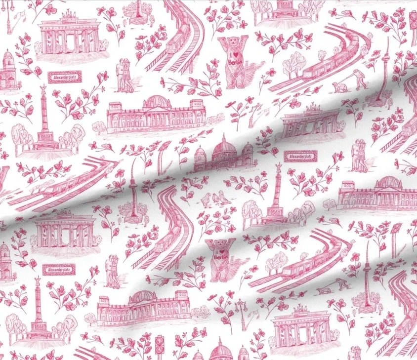
Challenge placement: 89.
5: Colors!!!
In my opinion, finding the perfect colors is the most important but also (at least for me) the most difficult step. Think about your own voting process in a design challenge. What draws your eye? Before you even look closer at the motifs, it’s the colors of a design. There are often so many submissions that most voters won’t take the time to take a proper look at all designs. Instead, they will only take a closer look if the colors are appealing to them.
I feel that generally more colorful designs tend to be more popular, but of course that also depends on the challenge prompt.
For the Retro Nouveau Challenge, I decided to go with a dark, moody floral design, my Retro Nouveau Chrysanthemum:

The dark background in combination with the gold outlines really makes the chrysanthemum motif pop. As you can see here, the orange flower is in the middle, framed by the red one. Originally, the red one was in the middle and the orange one framing it. But then I realized that if I swapped them, the orange would pop more than the red. So I went back to Illustrator and switched the flowers. I think this is a great example of what I mean by creating intentionally for the challenges. While it doesn’t make a difference on someone’s wall which flower is in the middle of my artboard, it does make a difference on the challenge voting page!
Challenge placement: 27.
That being said, it doesn’t mean that vibrant colors always sell better. For my Poppy Block Print design, I created several muted color versions too and these seem to sell at least equally well, if not better than the vibrant color versions.


6: Find the Perfect Scale
Along with color, scale is super important for the challenges, so you shouldn’t underestimate its power. I sometimes see designs that look great but are probably overlooked by voters because the scale is off.
What you should take into account when you decide your design scale for the submission, depending on your purpose:
- What medium will this design be shown on: wallpaper or fabric?
- Do I want voters to see the details of the design, the general layout, one main motif, …?
- Do I want voters to see only one repeat of the design or more?
Make sure to take a look at the preview of your design during the submission process! Once you have selected a challenge, your design will appear on the mockup of the challenge medium and you can immediately see if the scale fits your purpose.
Let’s do a little comparison, just for fun. For the Art Deco Design Challenge, I submitted my Art Deco Peacock Mosaic Design. For the challenge, I submitted the large version with only one repeat across the wallpaper roll (left). The small version of this design (right — which I have never sold, I think) just isn’t as eye-catching! The motif looks a lot less impressive in this small scale.


Challenge placement: 15.
Other steps you can take
If you use social media, you can promote your design there. I always promote my designs on my Instagram account because many of my followers are fellow Spoonflower designers. I usually have two posts for each submission. I can’t guarantee it will increase your chances. However, I suspect that if people have seen your design before somewhere, they might be more likely to vote for it.
As I was just going through the current design challenge submissions, I realized that posting your submission on social media to promote it can serve an additional purpose. There are a lot more AI-generated submissions in the challenges recently (even though it’s not allowed). So I caught myself thinking: “I like this design but maybe it could be AI-generated?” But when I know the designer’s name from Instagram, have seen some of their process, have even interacted with them — then I don’t need to wonder and I will happily vote for them.
What else can you do? You definitely have increased chances of a higher placement in the less popular design challenges. Of course you only know after submitting whether a challenge is popular. Anything floral will be super popular. Usually, when my first thought at seeing the challenge prompt is “oh no”, these are the ones with less participants. Less typical themes or more complex motifs might scare off some designers. And if you follow my approach of participating in every challenge, you don’t even need to think about that part anyway.
Does getting into the top 100 guarantee sales?
Nope, it doesn’t. But it definitely increases your chances. There are currently soooo many designs on Spoonflower so if you make it into the top 100, buyers can find your design more easily when they filter their search for only award-winners.
I also have sales on designs from non-top-100 and non-challenge designs, plus some top-100 entries that haven’t sold — but others get consistent sales. So, like I said: A top 100 placement is no guarantee for sales but it will boost your visibility.
You can check out all my top 100 placements here.
I hope there were some useful tips for you in my strategies. If you have any further questions, let me know in the comments or email me at hello@dalia-designs.com!
Sign up for my newsletter below if you don’t want to miss any updates!
Brief Summary (TL;DR)
These are my strategies for placing higher in Spoonflower Design Challenges: Proper research, no skipping the brainstorming phase, incorporating popular motifs, giving the designs my own twist, putting a lot of thought and effort in the colors, and finding the perfect scale.

Leave a Reply